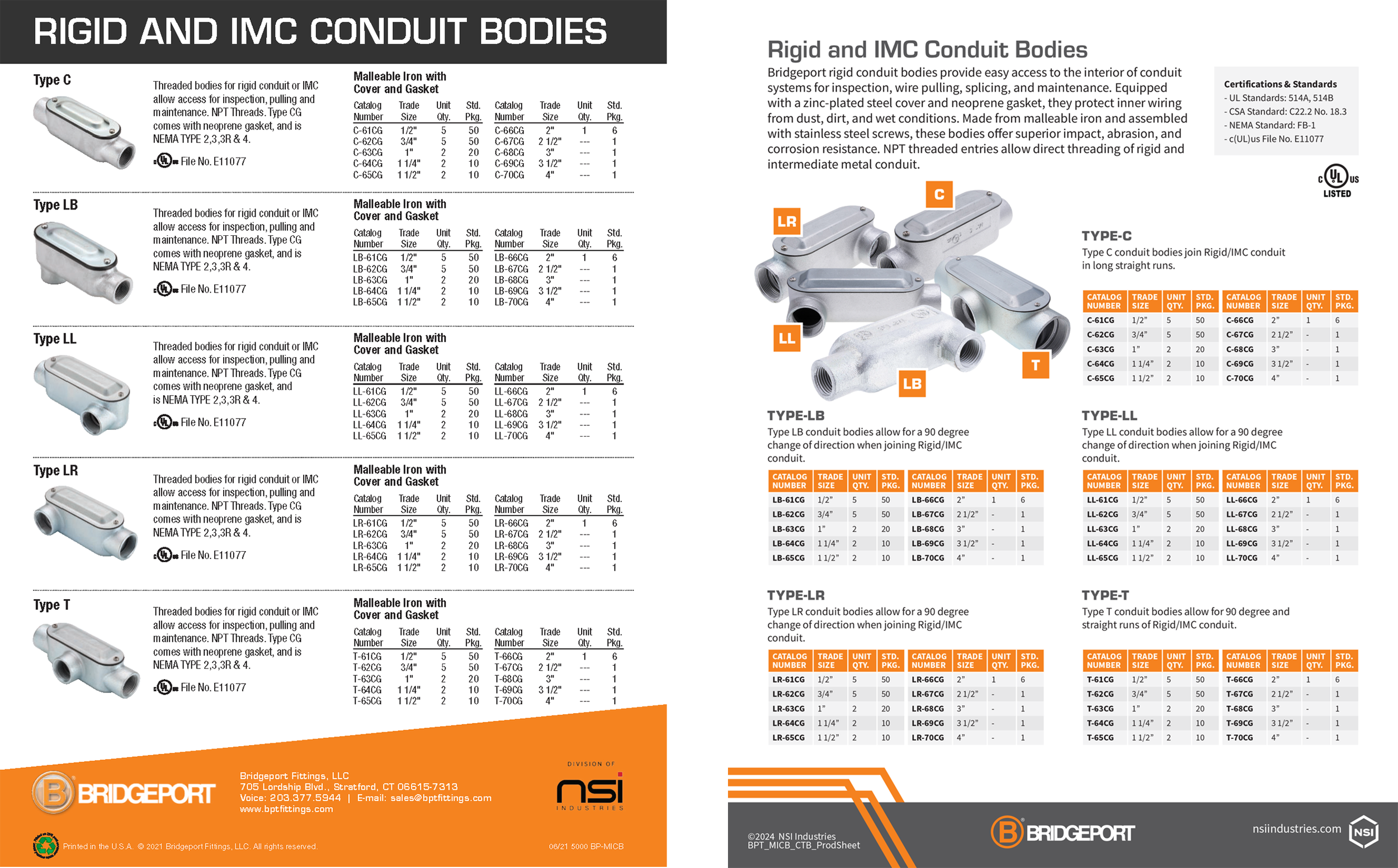
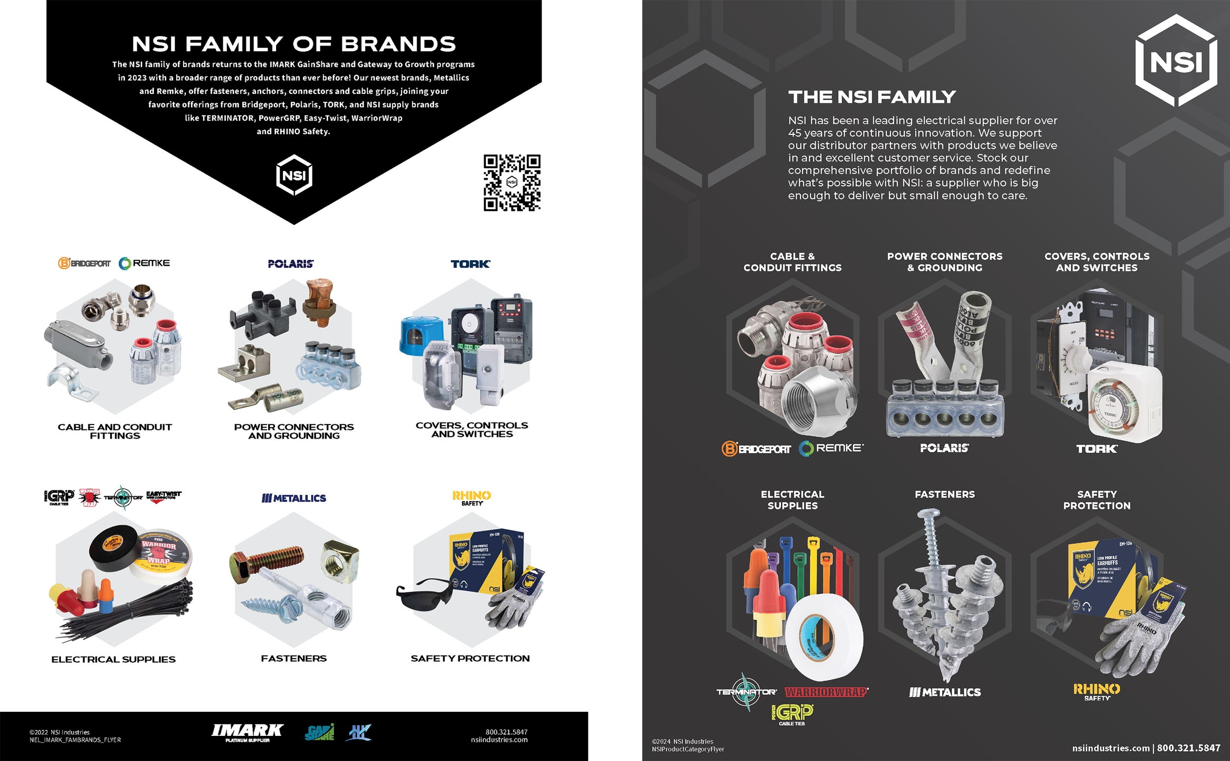
For these projects I had to take an old flyer created by another and redesign it with a more modern and eye-catching style.
FLYER REDESIGNS
This was a single page flyer that compared different parts from Bridgeport. They wanted me to rearrange the page to have a more interesting and easier to digest layout. I simplified the layout a bit by merging the five small paragraphs into one large block at the top. I then redesigned the tables to be more eye-catching and easier to digest. Finally, I placed the product images in a group shot with labels to create a little interactivity with the reader.
This flyer demonstrated all the major product categories at NSI and they just wanted a fresh coat of paint for the redesign. I left-justified the main block of text for a more professional look and placed the category names above the images since that was the most important information. The images themselves received the largest overhaul and were all separate product images combined in an interesting orientation. The background was originally created for a different project by another designer, which I used for brand continuity.
The original here was apart of a larger brochure that showed the connector categories of Polaris. They wanted a stand-alone single page version that their salesmen could hand out. I kept the overall design similar, but added a catchy header that introduced the products and brand better.


